
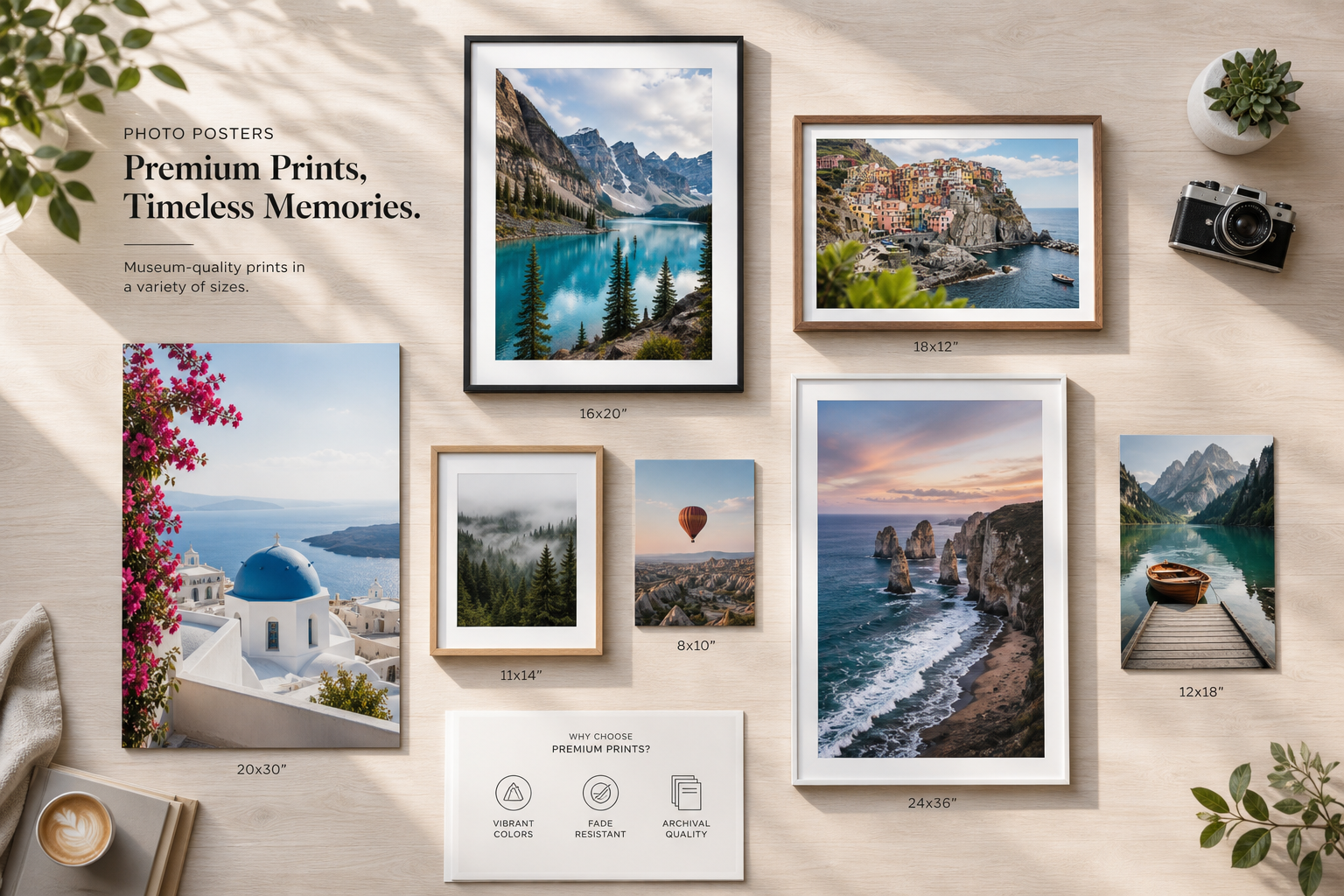
Discover how custom photo poster prints turn personal photos into stunning wall decor. Learn sizing options, materials, design tips, and pricing to create the perfect personalized poster.
Over 73% of homeowners now personalize their living spaces with custom wall art rather than mass-produced prints. The shift reflects a fundamental change in how people approach home decoration—moving away from generic options toward spaces that genuinely reflect their personalities and memories.
Custom photo poster prints have emerged as the practical answer for anyone seeking affordable, high-quality personalized wall art. These prints deliver professional-grade results without the gallery price tags, making them accessible to virtually anyone with a favorite photo and a wall to fill.
Whether you're decorating a bedroom, office, or living room, custom photo poster prints combine straightforward online customization with results that rival gallery-quality framing. Discover how to create stunning custom photo poster prints that transform your walls today.
Choosing the Right Poster Size for Your Space
Understanding standard poster dimensions and how they fit different wall configurations
Poster sizes follow predictable patterns that make selection simpler than it seems. Standard dimensions include 8×10, 11×14, 16×20, 18×24, and 24×36 inches, with each size serving specific purposes and wall conditions. Smaller prints work beautifully for clustered gallery walls or compact spaces, while larger formats command attention in open rooms and above furniture pieces.
Measuring your wall space accurately to avoid undersized or oversized results
Before uploading a single photo, measure your wall carefully. Start at the center point where you want the poster to hang, then mark horizontal and vertical boundaries. Accounting for furniture placement below and architectural features above prevents purchasing a print that looks lost on the wall or overwhelms the space entirely.
Scaling considerations for small apartments versus large open-concept homes
Small apartments benefit from proportional sizing—prints that relate to wall dimensions without consuming the entire surface. A 16×20 typically works better in compact bedrooms than a 24×36, which needs substantial wall real estate to feel balanced. Open-concept homes and living rooms can accommodate larger formats that serve as focal points without appearing cramped.
Vertical versus horizontal orientation and its impact on room flow
Orientation shapes how your eye moves through a room. Horizontal (landscape) prints encourage visual flow across a wall and feel expansive, while vertical (portrait) prints draw the eye upward and suit taller walls or narrow spaces. Matching orientation to your room's proportions creates harmony rather than visual tension.
Creating gallery walls with multiple custom prints in coordinating sizes
Gallery walls gain power through intentional coordination. Select 3-5 prints in complementary sizes—perhaps one large 16×20 anchoring the center with smaller 8x10s surrounding it—and maintain consistent spacing of 2-3 inches between frames. This approach transforms individual prints into a curated installation that feels deliberately designed.
How poster placement affects perceived room size and ambiance
A single large print positioned at eye level can make a room feel more spacious by creating a visual focal point. Conversely, clustered smaller prints at varying heights add intimate detail and architectural interest. Lower placements feel cozy and personal, while higher placements convey openness.
Size recommendations for office spaces, bedrooms, living rooms, and entryways
Office environments typically call for professional-scale prints—16×20 or larger—that establish authority and sophistication without distraction. Bedrooms work with any size depending on wall availability, though 11×14 and 16×20 feel personal without overwhelming. Living rooms accommodate commanding sizes like 24×36, while entryways benefit from immediately noticeable prints around 16×20 that set the tone upon entry.
Paper Types and Finish Options Explained
Premium photo paper for vibrant color saturation and professional appearance
Premium photo paper delivers the richest color depth and sharpest detail reproduction. This option uses specialized coatings that intensify hues, making reds deeper, blues more vivid, and blacks more prominent. The result feels genuinely photographic rather than printed, appealing to anyone prioritizing visual impact and professional presentation.
Matte finishes for reduced glare and a sophisticated, gallery-like aesthetic
Matte finishes eliminate reflections entirely, creating a sophisticated gallery-quality appearance that works in any lighting condition. This option suits fine art photography, black-and-white images, and minimalist designs where subtlety matters more than pop. The non-reflective surface encourages viewers to focus on content rather than catching glare from light sources.
Satin finishes that balance shine with texture for versatile room compatibility
Satin splits the difference between matte and glossy, offering gentle sheen without glare problems. This finish works across virtually all design styles and photo types, making it the safest choice when balancing aesthetics with practical performance. Colors appear vibrant without looking plastic, and textures remain visible without appearing dull.
Durability differences between standard and premium paper stocks
Premium papers use heavier gauges and superior coatings that resist fading, moisture, and dust accumulation. Standard options work fine for prints rotated frequently or displayed temporarily, but premium stocks justify their cost through longevity—maintaining color accuracy and physical integrity for years beyond standard alternatives.
How finish choice affects color perception and longevity
Matte finishes can slightly mute colors compared to glossy options but preserve them longer against UV exposure. Satin maintains strong color depth while offering fade resistance comparable to matte. Premium photo paper enhances both color vibrancy and longevity, making it the investment choice for irreplaceable images you plan to display permanently. Explore premium paper options for your custom photo poster prints and ensure lasting quality.
Resistance to fading, moisture, and dust based on material selection
Standard papers deteriorate faster in humid environments or rooms with abundant natural light. Premium stocks include UV-resistant coatings that slow fading significantly. Moisture resistance varies by finish—glossy and satin coatings perform better in bathrooms and kitchens than matte alternatives, which absorb moisture more readily.
Thickness and weight considerations for framing and hanging stability
Heavier paper stocks resist warping and creasing, particularly important for large formats that must maintain flatness over time. Thicker papers also feel substantial in hand and project quality during unboxing. Weight varies from standard (around 80gsm) to premium (200gsm+), with heavier options requiring sturdier frames and mounting hardware.
Environmental factors and which finishes perform best in humid or bright environments
Bathrooms and kitchens demand moisture-resistant finishes—satin and glossy options outperform matte in these spaces. Bright, sunny rooms require UV-protective coatings on premium papers to prevent fading. Basements and windowless rooms benefit from standard papers since environmental stress remains minimal, reducing the justification for premium upgrades.
Designing Your Perfect Custom Print
Image resolution requirements to ensure sharp, crisp results
Resolution matters enormously when enlarging photos to poster size. Aim for at least 300 DPI (dots per inch) at your intended print size to ensure sharpness. A smartphone photo taken at standard resolution may look perfect on a phone screen but appear pixelated when enlarged to 24×36 inches. Before uploading, verify your source image contains sufficient detail—professional photographs, high-resolution camera files, and quality digital artwork perform best.
Cropping and composition techniques for maximum visual impact
The preview tools within most customization platforms let you experiment with cropping before ordering. Position your subject using the rule of thirds—placing focal points approximately one-third into the frame rather than dead center—for more dynamic composition. Eliminate distracting backgrounds and ensure adequate negative space that prevents the image from feeling cramped.
Color correction and enhancement tools within preview platforms
Most platforms include basic color adjustment capabilities: brightness, contrast, saturation, and temperature sliders. Warming up cool family photos or cooling down overly warm sunset images can dramatically improve results. Increasing saturation modestly makes colors pop without appearing artificial. Preview these adjustments at actual print size whenever possible, as screen displays render colors differently than paper.
Aspect ratio matching to prevent unwanted stretching or cropping
Mismatched aspect ratios cause frustrating results—either your image stretches unnaturally or the system crops portions you wanted to keep. If your photo is 4:3 but you order an 8×10 (which is 4:5), something must give. Most platforms warn about this during upload, offering options to crop or adjust. Make these decisions consciously rather than accepting default suggestions that might remove important content.
Typography and text overlay options for personalized messages
Adding names, dates, or meaningful quotes transforms a photo into a personalized treasure. Use legible fonts and sufficient contrast between text and background. Light text on dark backgrounds or dark text on light backgrounds ensures readability from typical viewing distance. Positioning matters—text in corners remains readable without competing with image content, while centered text works for minimalist designs where text becomes part of the composition.
Filter and effect applications that enhance without overdoing
Subtle filters can enhance mood without overwhelming authenticity. Vintage effects work well for nostalgic family photos, while crisp black-and-white conversions suit emotional portraits. However, resist over-processing. Each effect should serve a purpose—enhancing the image's emotional resonance rather than simply adding visual novelty that dates poorly.
Batch uploading for coordinated multi-print projects
Gallery wall projects benefit from coordinated editing. Upload multiple images simultaneously and apply consistent color adjustments across all of them, ensuring visual harmony when printed. This batch approach prevents the jarring effect of one print appearing significantly warmer, cooler, or more saturated than its neighbors.
Preview tools that show exactly how your design will appear before ordering
Reliable preview tools are worth their weight in gold. They display your custom print at actual dimensions, showing how it will look framed and hung on your specific wall. Use this feature extensively—test multiple sizes, experiment with orientations, and visualize the finished product before committing financially. This step prevents costly mistakes and ensures satisfaction upon arrival.
Make Your Walls Tell Your Story
Custom photo poster prints represent far more than a decorating trend—they're a practical, affordable way to fill your walls with meaning. The combination of straightforward customization, quality materials, competitive pricing, and versatile applications makes these prints ideal whether you're refreshing your bedroom, gifting something memorable, or establishing a professional office aesthetic.
The key to success lies in understanding your options: selecting the right size for your space, choosing materials that match your vision, and leveraging preview tools to ensure perfection before you order. Start with a favorite photo, experiment with different sizes and finishes using the preview tools, and watch your walls become a reflection of what matters most to you. Start creating your custom photo poster prints now and bring your vision to life.